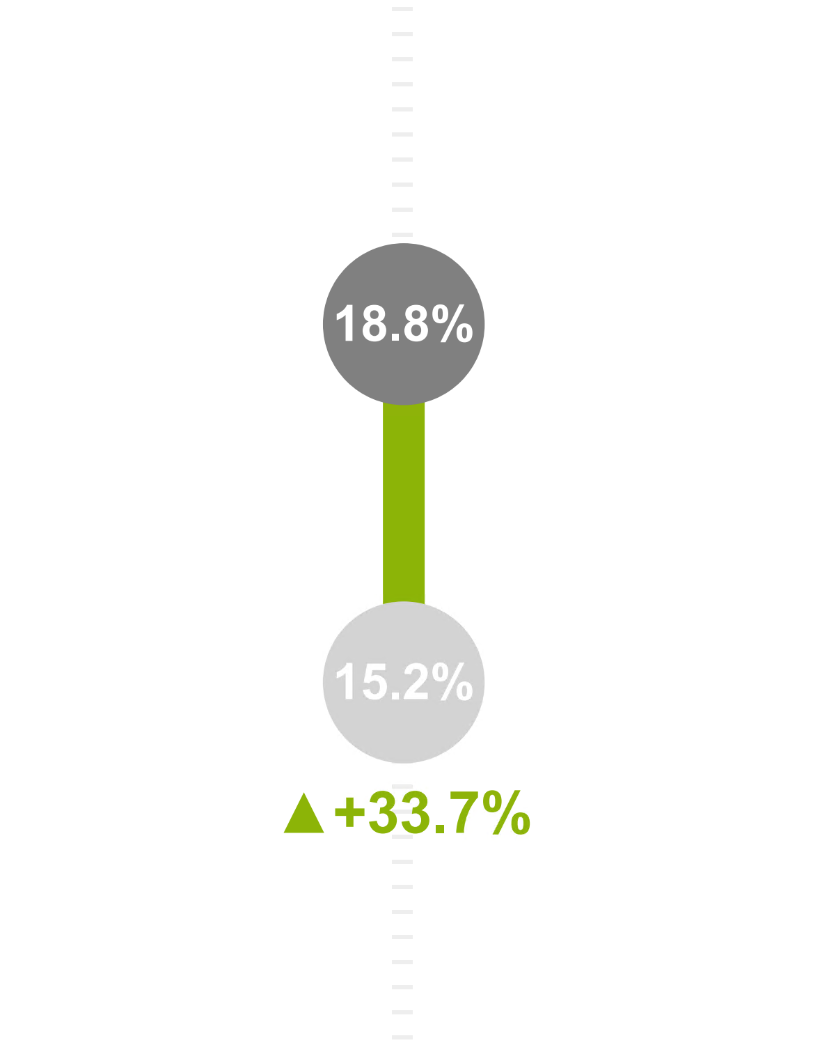
Lollipop Chart with Percentage Change Indicators
This visual, created using Deneb and Vega-Lite, is an adaptive and interactive “Lollipop Chart with Percentage Change Indicators”. It showcases the positive and negative variances across various product categories, providing both absolute and relative performance insights. The chart supports cross-highlighting and native tooltips, enhancing its interactive capabilities.
LOLLIPOPS
Lollipops: Circles representing current values.
Sticks: Lines connecting the current and previous values, depicting the range of change.
Percentage Change Indicators: Gray circles with percentage values and colored arrows (green for positive, red for negative) indicating the magnitude and direction of change.
Interaction
The visual supports native cross-highlighting, meaning interacting with one part of the visual (e.g., clicking on a specific category or data point) will highlight related data points across the visual. This feature is useful for drilling down into specific data and understanding correlations or impacts across different categories.
NAtive Tooltips
The tooltip in the visual provides detailed information for each data point, enhancing the user’s understanding of the variance in each category.


