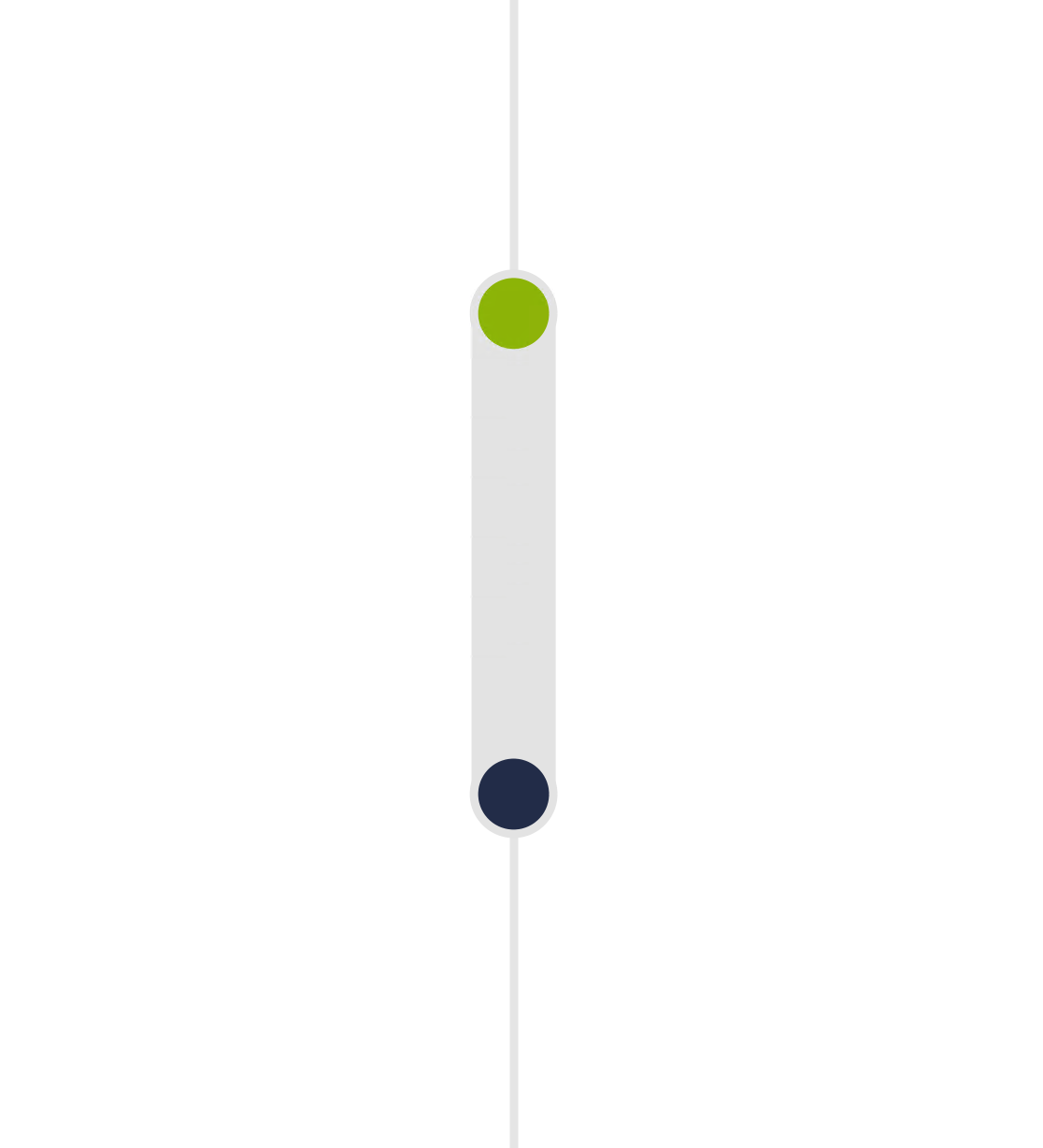
Diverging Dot Plot with Range Bars
This visual, created in Deneb using Vega-Lite, effectively illustrates the positive and negative variances across various product categories. The design is adaptive, which means it can adjust to different screen sizes or data changes, and it supports native cross-highlighting, enhancing its interactive capabilities.
Error Bars/Range Bars
Each category has a vertical bar showing a range, which indicates the variance span for that category. The bar’s length provides a visual representation of the variance’s magnitude.
Positive Variance: Indicated by green markers above the base value.
Negative Variance: Indicated by red markers below the base value.
Interaction
The visual supports native cross-highlighting, meaning interacting with one part of the visual (e.g., clicking on a specific category or data point) will highlight related data points across the visual. This feature is useful for drilling down into specific data and understanding correlations or impacts across different categories.
NAtive Tooltips
The tooltip in the visual provides detailed information for each data point, enhancing the user’s understanding of the variance in each category.


