
Power BI Report: Days Lived vs. Remaining

Idea
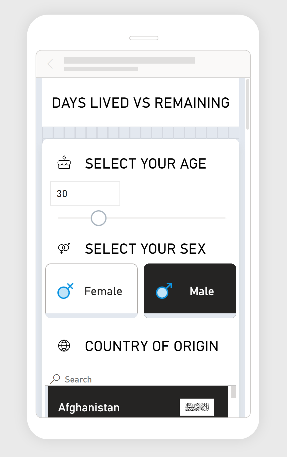
The core concept of this Power BI report is to visualize the number of days an individual has lived against the estimated days remaining. This is predicated on demographic data such as age, gender, and country of origin, offering a personalized snapshot of one's life expectancy. The goals was to trigger self-reflections about one’s life, passage of time, and changes to be made.
Interactive Report
Schema
The report's schema is fairly simple:
'Life Expectancy at Birth' table represents data about life expectancies for different countries, sexes and years.
'Countries' table represents countries and country codes.
'Icons' table contains few icons encoded in base64.
'Country Flags' table represents countries with flag image URLs.
'ISO Country Codes' represents list of countries with iso2 and iso3 code to be able to join data between country flags and countries.
'Your Age' DAX table is a simple GENERATESERIES table representing slicer values.


Challenges and Technical Solutions
Several challenges emerged during development:
Custom Visualization: The need for a bespoke visual representation not supported by native Power BI visuals.
Solution: I had to develop a custom Vega visual tailored to the report's requirements, allowing for the desired level of customization and interactivity.
Edge Case Handling: Power BI's default behavior of passing the entire table as a filter context when slicers are unselected was overloading the visual with data, causing memory crashes.
Solution A: I had created a custom measures to monitor slicer selections, designed to nullify the report's output if multiple values are detected, thus preventing data overload.
Solution B: I had implemented a safety check within the Vega visual that ensures values are within a safe range and prompts the user with a message when multiple values are selected.
Adaptive Design: A third challenge was ensuring that the Vega visual dynamically adapts to various screen sizes and aspect ratios. It was essential that the visualization remained fully functional and aesthetically pleasing across all devices.
Solution: I implemented responsive design techniques within the Vega visual. This included writing conditional logic to detect the visual's width and height and then adjusting the layout, scaling, and positioning of elements accordingly. This ensured that the visualization automatically resized and reflowed to fit the space provided, preserving both functionality and visual integrity regardless of the display size, and allowing to develop fully functional and interactive mobile layout.

⚠️
Please note that currently Power BI doesn’t allow embedding Mobile layouts, therefore mobile version is available in mobile application only.
Data Sources
The report utilizes datasets from:
World Health Organization API: https://www.who.int/data/gho/info/gho-odata-api.
Flagpedia API: https://flagpedia.net/.
OpenDataSoft Country Codes API: https://public.opendatasoft.com/explore/.