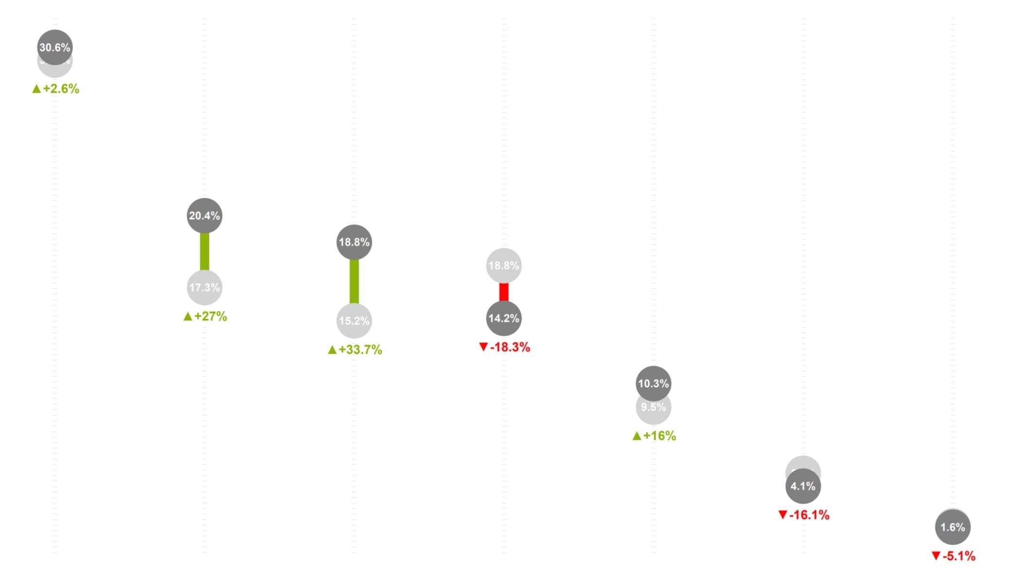
A custom Deneb visualization that combines lollipop charts with percentage change indicators.
What is a Lollipop Chart?
A lollipop chart is a variation of a bar chart where bars are replaced with lines and dots. This creates a cleaner, more elegant visualization that's particularly effective when:
- Comparing values across categories
- Showing rankings
- Displaying sparse data
Enhanced with Percentage Change
This implementation adds integrated percentage change indicators that show:
- Direction of change (up/down arrows or colors)
- Magnitude of change
- Comparison to previous period or target
Built with Deneb
Deneb is a custom visual for Power BI that brings the power of Vega and Vega-Lite declarative visualization grammars. This allows for:
- Highly customized visualizations
- Complex interactions
- Pixel-perfect design control