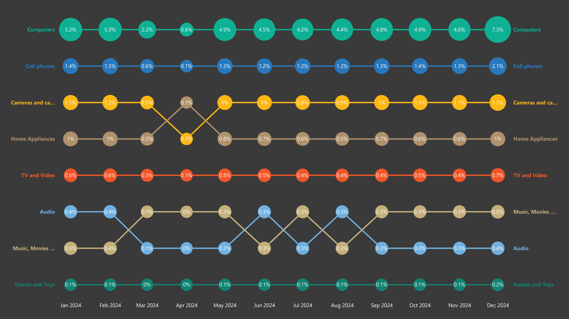
A bump chart visualization designed to show rank or percentage changes across different categories over a specific period.
What is a Bump Chart?
A bump chart is a special type of line chart that shows how rankings change over time. It effectively highlights how each category performs relative to others, making it a powerful tool for:
- Tracking trends
- Showing shifts in position
- Making comparisons over time
Example Data
The visualization demonstrates ranking changes for product categories:
- Computers - Tracking market position over time
- Cell Phones - Mobile device market trends
- Cameras - Photography equipment rankings
Built with Deneb
This Deneb implementation includes:
- Smooth line interpolation between ranks
- Color-coded category identification
- Labels on both sides for easy reading
- Responsive design for different report sizes